Website Creation: Website Research
As we will be creating our own website, I will research about two websites related to my project. I will compare the websites and find inspiration on what to use for my own website later on.
I will be studying the websites from Roger Deakins and Rachel Morrison as they are the cinematographers I will be researching further for my major project. It seems that Roger Deakins' website is managed by his team and Rachel Morrison's website is managed by herself.
I will start by looking at Roger Deakins' website. The homepage can be seen below.
I like how the homepage is simple and neat. The main colour used is not a common colour however, they made it work as the background is a plain white and creates a pop of colour. The placement of the section pages is mainly on the left, which is not something I see often in websites, but they have made it work somehow. I also like how they have made a permanent announcement section hence the audience can easily understand where and what to do. As shown above, they have added a section on the right hand side about recent topics and replies the members of the website have discussed along with a log in section for the audience however, the placement is not ideal as it is at the bottom section.
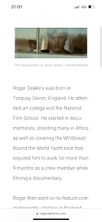
For the 'About Me' page, I like how they kept it simple again with the paragraph however, I do think they should have used an image of Roger Deakins himself and not an image of one of his works. They have also used a icon button with an arrow in it that, when you click it, it will direct you to the top of the website. Which I may use this icon for my own website as I like the benefit of it.
As for the 'Contact' page, they used another image of one of Roger Deakins' works and I like how it looks. They then have the small sentence for the audience, to direct them on what to do on this section. I may be using a similar layout for my contact page as I like how simple it is.
They have placed the copyright at the very bottom center for every page, something I would like to implement as well in my website later. However, I did not see any social media icons in the website at all.
As seen from the screenshots, the website works just as well in mobile view as it does in webpage view. I like how the menu button is located in the center hence creating an easy and accessible option for the audience. I believe the website looks better in a mobile view as the layouts are well planned and there is not much whitespace unlike the webpage view.
Secondly, I will be looking at Rachel Morrison's website. The homepage can be seen below.
As shown above, Rachel Morrison uses a slideshow for her homepage. It is a slideshow containing her previous cinematography works and I like how it looks. She kept it simple with the colours, being only black and grey. For the header, she has placed the section pages on the right side, which is much more common than being on the left side. I also like how it is simple and easily usable for first-time comers.
For the 'About Me' page, she has put an image of herself and a few quotes she may have said herself. I like how professional and simple it is. She has also included quite a complete and long paragraph about her journey in the film industry. This page is also simple and does not have much distractions.
As for the 'Contact' page, she does not have a form, like most websites do. The contact that she has are of her managers and agency. I like how she included her social media accounts on the bottom left along with her copyright mark on the bottom right on every single page hence it is easy for the audience to access.
This is the mobile view for Rachel Morrison's website.
As seen from the screenshots above, Rachel Morrison's website does not work as well as it does in the webpage view. The homepage can be seen with a lot of whitespace and it creates an unsatisfying look from the first page. Though I do like how the menu button is on the right-top part of the page and easily accessible. However besides the homepage, every other section looks just as fine as it does in the webpage view.
Comparison:
Seeing the two websites, I have taken a liking to Rachel Morrison's website as it looks aesthetically pleasing and neat. However, she did not implement a direct contact form and the layout did not suite the mobile view. As for Roger Deakins' website, they had complete pages and lots of directions to help the audience on where to go but I did not like how it looked overall. Roger Deakins' website is more usable and easily accessible in terms of technical points compared to Rachel Morrison's website.
Reflection:
I really like how both the websites are simple and easily usable for the audience as there are not much distractions and extremely direct on what the content is. Moreover, I like how Rachel Morrison's website looks as a whole and I would like to create a similar layout to her website however, she does not have a contact page. Hence why I would like to implement a similar layout of the contact page from Roger Deakins' website as it looks easy to use and with many directions on what to do.


Comments
Post a Comment