Website Creation: About Me Page
As I am creating a website, I will have to create an 'About Me' page.
I started by clicking the '+Add' button to add a new page with a selection of templates for certain sections. I selected the 'About' option and chose the simple template called 'Profile'.
As shown below, I have added a new page for my 'About Me' section and changed the size to match with the other pages.
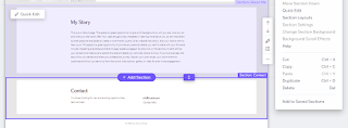
I decided to delete the bottom section that was given from the template as I did not like how it looked.
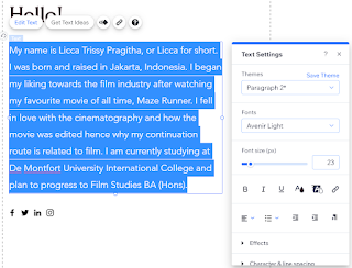
I continued onto my 'About Me' paragraph by copy and pasting the text I have made previously and posted on my blog here. In which, I changed the size into 23 and widened the text area. I also deleted the selection of social media links given from the template.
I then decided to copy and paste the remaining text onto the section below, as I still had many white-spaces and changed the size to 20.
Moving on, I changed the stock image given from the template into my own as the person in the image is not myself. I start by selecting the 'Quick Edit' option to change the image.
I selected the '+ Upload Media' button and uploaded my image that I have previously uploaded onto my blog posts.
I then changed the size of the image to create a nice fit into the template.
This is my 'About Me' page in a web page view.
This is my 'About Me' page in a mobile view.
Reflection:
I really like how this page turned out as it looks neat, organised and not as cluttered as I thought it would be. The information written is the main subject and it looks that way.
Though in the future, I would like to change the image I used as it is not quite professional in my opinion.


Comments
Post a Comment