Website Creation: Gallery Page
Similar to the 'About Me' page and 'Contact' page, I will have to create a 'Gallery' page to promote my project. As I have already been given a page section from my theme, I decided to start from there and continue the edits with my own ideas.
I start by clicking on the 'Portfolio Pages' section and clicked on 'GALLERY' to start editing. I first selected the image already given and clicked the 'Layout' button and changed it into 'Grid' as I liked how neat it looked.
As seen below, there are already posts made from the template I chose. I decided to delete all the posts except for one so I can edit that post instead of creating a new one and wasting time.
I then clicked on the 'Edit' button and continued to edit the post to create my own.
As I have already written a small paragraph previously in a Word document and already have it checked, I will use this paragraph for a little introduction on what my project is about.
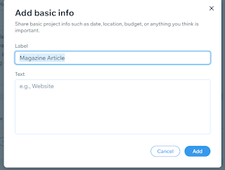
Before I added the paragraph in, I decided to add some basic info about my project. As I had options, I chose to add 'Project Type' and a 'Date' so the audience can know what type of project it is and when I had created it. I changed the 'Project Type' label to 'Magazine Article' and added '2023' under the label 'Date'.
I then added the paragraph into the 'Description' box and changed the title to my project title which was 'Cinematography: The History'.
As I was still confused on what to put as the cover image for my post, I decided to leave it empty and will add an image later on.
I then clicked on 'Save & Close' to save it all and go back to the 'Projects' page. As seen below, that is how my post will look like in the website.
After a few thoughts, I decided to add an image from Pixabay. It is a picture of a clapboard, mainly used to create a timing for the editor of the movie of when the scene will start and it is related to my project hence why I selected this image.
I then clicked on 'Manage Media' and uploaded the image to add it as a cover.
This is what the result looks like.
I thought that the description box is too small hence I decided to increase the size to 20 and to keep the font as to match with the other pages. I also proceeded to change the character spacing to 0.1 and the line spacing to 1.6 to discard the unnecessary whitespace.
I then changed the colour of the title to match with the whole theme of my website so it can be recognised easily as the title.
This is the webpage view for the 'Gallery' page and my 'Project' post.
This is the mobile view for the 'Gallery' page and my 'Project' page.
Reflection:


Good that you described the technical process of creating your Gallery. Are you going to make any further changes on your Gallery?
ReplyDelete