Website Creation: Home Page
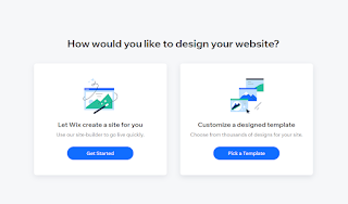
To create a website, I opened Wix and created the website name, liccatrissy. As I had to create a professional name, I decided to just use my name as a the website name. I then selected the 'Film Student Portfolio' option as the website I am creating will mostly be about film studies.
I then clicked the 'Pick a Template' option and chose the template called 'Filmmaker' from the criteria 'Film & TV'. I chose this template because it relates to my progression route and I like how the layout looks.
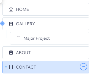
I then clicked the 'Site Pages and Menu' button to reveal the pages already created from the template. As I did not need need 'Showreel' and 'Blog', I deleted the pages and added a new sub-page in the gallery called 'Major Project' for my project submission page later on.
After creating changes to the pages, I decided to change the site theme as the theme given from the template is not to my liking and does not appeal in my opinion. I selected the 'Nostalgic' theme as I like the soft but bold colours it has along with the change of font. I also decided to change the background colour to grey and changed the page transition to vertical to create a satisfying effect.
As shown below, the font and size of the page names has changed according to the template I have chosen.
Afterwards, I selected 'Quick Edit' on the home page and changed the title into my name, 'Licca Trissy'. I also added a sort of sub-title with the writing 'Film Studies Student' to enhance more of who I am and what the website will mostly be about.
As told in class, I have to change the copyright at the bottom of the page. I changed the copyright sentence as shown below.
This is how it looks like from the website.
I thought that the title needs more colour as it looks quite dull, hence why I decided to change the colour to one of the main colours in this theme which is a light maroon colour.
As shown below, there was a vector art available from the previous theme and I wanted to change the icon into an arrow to create a simpler look.
However, I decided to change the icon into an actual button as I thought that it will look more neat and organised.
I then linked the button to my gallery page as that will be the main page of my website.
However, I decided to compare my selections as I thought this one can also suit the theme and layout.
As shown below, I started to compare between the two options I liked and will decide which one I will use. I decided to use the second option as I liked the animation it gave off and how it suited the theme and layout better after I changed the background colour of the button.
Here, I decided to change the sub-title colour from a dark grey to black as I did not like how the dark grey did not match with the light maroon.
I also decided to change the writing on the button as I thought 'DISCOVER MORE' would be more appealing.
As I was satisfied with all of the texts, I move on to delete and change the image on the home page as it was not my picture.
For the image, I chose this image I took when I went to South Korea last year as, right now, I like how it looks for the image that relates to history and cinematography.
I then clicked on 'Media' and clicked on 'Upload Your Media' to upload my chosen image.
I then did some adjustments and cropped the image to fit better on the layout.
As a last edit, I decided to increase the size of the sub-title as I thought it was too small.
This is my home page in a web view
This is my home page in a mobile view
Reflection:
As this is the first time I used Wix, I was quite confused at first as to how this software works and how I can manage everything but after quite a few practices I managed to understand most of the things I am supposed to do to create the website. Though, I still have some difficulties in understanding how some elements work but the more I practice, the more I will understand. For now, this is how my home page will look like and maybe in the future, I will change a few little details.


Comments
Post a Comment