Creating the Advertisement
I wanted to create my advert using Pixlr. I began by selecting the 'Create new' button on the homepage. I then selected the 'A4' size under the option 'Print' and clicked 'Create'.
I then clicked the 'Add Media' option inside 'Add Element/Image' and selected the image of a softball field that I got from Pixabay. I enlarged the image to fit into the A4 size I selected.
On top of that, I added on a plain white rectangle in which I decreased the opacity to 75 to create a tinted type over the original background. As though to not make the background as strong.
I then add on my logo, that I have created previously, on the top right corner of the advertisement poster while also resizing it to make it fit.
I then added on the navy blue rectangular box for my information section of the advertisement. I decreased the opacity to 70 to create the same effect as the background and to lessen the boldness of the colour.
Continuing, I added on the images of myself and a softball player with the background removed. I removed the background using a new feature from the Apple iPhone 13, which is where you tap the person in an image and hold it until the options 'Copy' and 'Share...' appears. The feature being extremely convenient, I used the same method for both images I used in the advert. I also used the 'Cutout' tool to crop the image to make it fit.
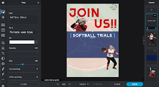
As shown below, I decided to change the font as I took a liking to this new one. I changed it to the font 'Father and Son' and changed the font size to 560.
I then began to add the text inside the navy blue rectangular box to tell the audience more about what this advert is about and what it offers. For all texts inside the rectangular box, I used the same font as before, 'Father and Son', in various sizes (as shown below).
Looking at the background, I decided to decrease the opacity of the white part again to 53 as I thought that it was overly covering a lot of the main background.
I then also decided to increase the size of my logo to fill the empty space it had next to it and decided to change the image of myself to a different image as I thought that the jersey colour my previous image had was clashing with the colour of the "JOIN US!!" text.
I then added the tagline 'Look Like A Beauty Play Like A Beast', to show that girls are not all about being pretty in this society. It is not all about our 'Beast' appearance from the outside however, it is about being strong and confident from the inside out. To add more depth to the text, I decided to add on some colour on to the words 'Beauty' and 'Beast' to enhance it more.
As a finishing touch, I added text on the bottom left corner as a contact section. A section where the audience can contact us if they want to register for the free trial or if they want to check out our social media first. I also added text on the bottom left of the rectangular navy blue box as an information for the audience that all equipments will be provided.
This is my final advertisement appearance.
I then saved it in a JPG format onto my desktop so I can upload it to my blog.


Comments
Post a Comment