Website Update: Home Page Update
As I have received feedback about my website from the form I created, I will implement all the feedback given into improving my current website and will be posting the changes in this post.
One of the feedbacks mentioned about the image used on the homepage and how it did not match with my continuation route. Therefore, I decided to search for film studies-related images in Pexels, a free stock image website and selected this image.
I selected this image as it is an image of three cameras aligned together for a production making sensation and it relates to my continuation route, film studies.
As I need to change the image, I begin by clicking the existing image once then selecting the 'Change Image' option. I then select the 'Upload Media' option and uploaded the new image.
As seen below, this is how the new image looks like in the homepage.
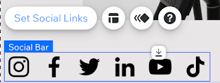
Listening to my feedbacks, they suggested that I insert my social links in every page. Therefore, I begin to add the said social links by clicking 'Add Element', then 'Social', then 'Social Bar', and finally selecting the full black coloured option.
In which I then located under the image by the bottom left-hand side. I proceed to select the 'Set Social Links' option as I need to edit the icons and add links.
I then continued to add a link for the icon by selecting the 'Web address' and inserting my blog web address and selecting the 'New window' as I want the audience to be directed to a new window when clicking the icon.
As I said previously, this social link will be inserted into every page hence why I selected this option, 'Show on All pages', by clicking the icon with both my fingers.
I then changed the placement of the icon to be in line with the copyright sign to give it a good balance.
This is how the update turned out.
To finalise, I decided to add another button next to the existing one as I think it will add more depth. I begin by selecting the 'Add Elements' option, then 'Button', then 'Themed Buttons', and then selecting the same style as the existing one.
I then linked the button to the 'About' page and changed the text to 'About Me' and deleting the icon.
I then changed the background colour of the button to match with the background of the original homepage.
I then decided to change the previous existing button's text to 'My Gallery' as I think it will create less confusion.
Continuing on, I decided to create the title to a smaller size into one line along with lessening the size of the 'Blogger' icon.
As seen below, I have created a sentence to welcome the audience visiting. I used the colour black, the 'Avenir Light' font and the size of 16.
I then decided to change the sentence as I was not satisfied with it.
I continue to change the sentence as I think the previous sentence was too much. I proceed to change the sentence to a simple welcome sentence and change the font to 'Cormorant Garamond Semi Bold'.
Refelection:
I felt that the feedback I received was extremely helpful and useful as I did not see the problems I had with my website. Re-editing the homepage was quite stressful as I had to edit quite a lot but in the end it turned out nice and I am satisfied with how it looks now.


Comments
Post a Comment